Palats — A better user experience
Year 2021
Role
UX research
UI design
Tools
Figma
Team
Mohamed El-Chehabi
And me
Concept
Our client Palats is a digital platform for the real estate market to keep track of their inventory directly in your phone or computer. This tool enables circular material handling.
Brief
Our mission was to come up with a solution to create a better user experience when handling inventory in the app.
Problem solving
So we got the following brief in front of us:
"How can you help us do this better?”
Research
- What we started to think about was how we could help the user to more easily navigate the app and see what kind of products they have in front of them.
- We did an external analysis and looked at other services that have similar "map features" where we felt it was easy to navigate the map without feeling overwhelmed by number of symbols. Such as Game Companies, Hemnet and Voi.
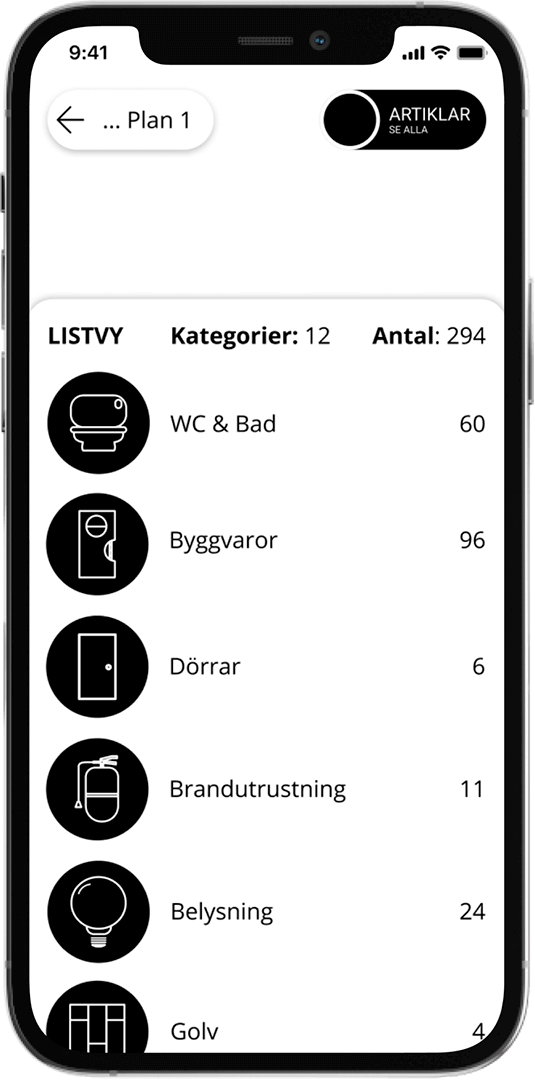
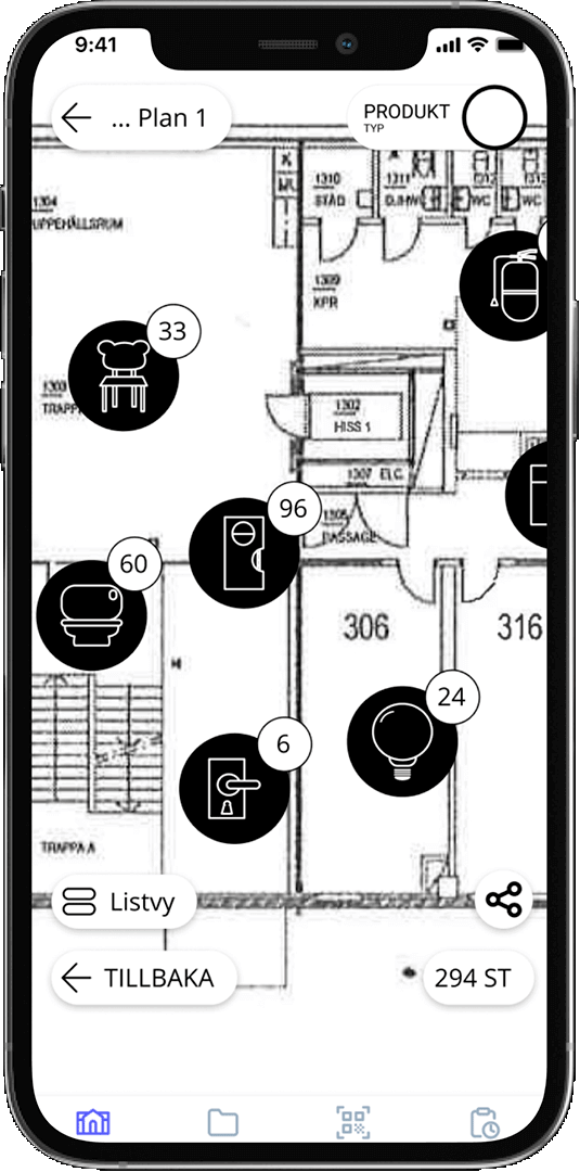
- In addition to the need to navigate in the floor plan and list view, there was a need to be able to navigate among different articles and articles within the same category — where the user should be able to sort and navigate simultaneously in both the floor plan and the list view.
- The list view needs to be informative and able to provide direct data on the type of information that the user is looking for or has filtered for. The floor plan shall visually present the current situation to the user.
User tests
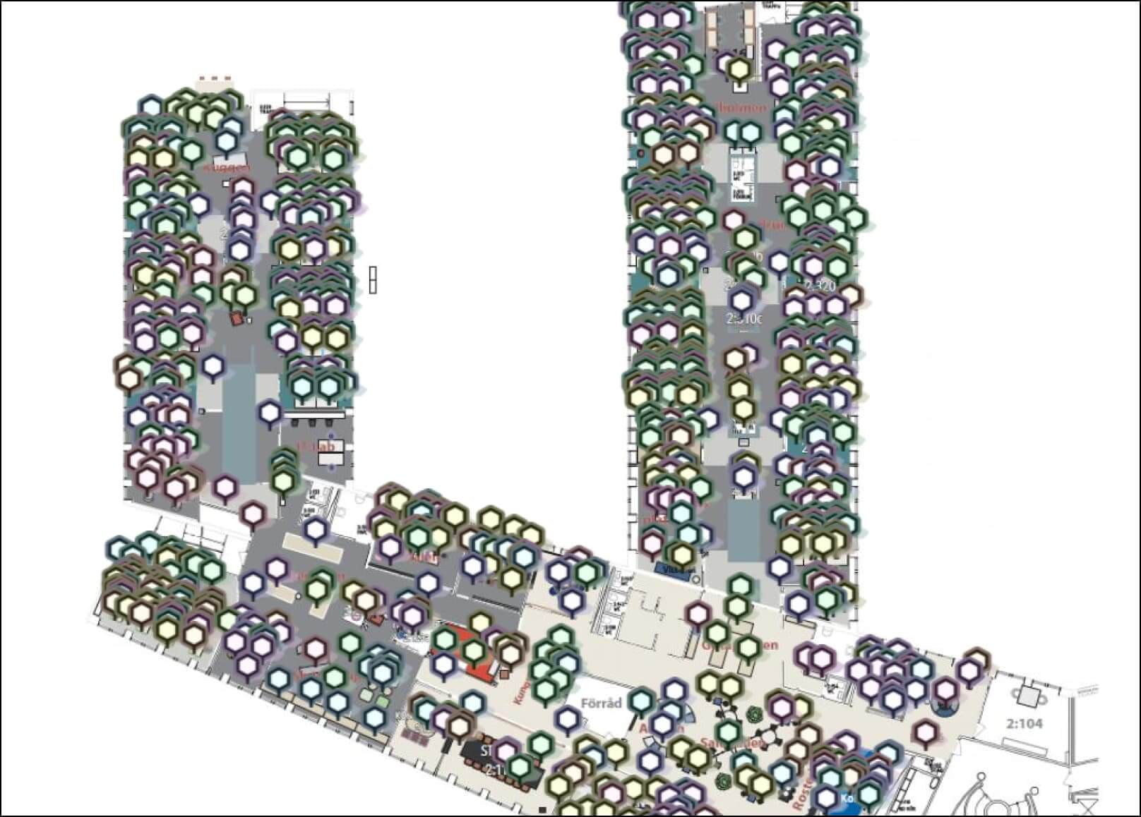
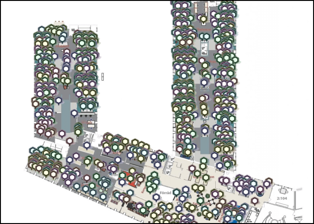
After the first meeting with Palats, we developed proposals with color categories, based on clusters and sections. But after continuing user tests and interviews, and since there are several different categories that may be expanded, we developed a system with icons instead, in black & white with red as complementary color for information symbol.
“Very nice! Like that you have chosen symbols instead of color combinations. Easy to understand.”
– Anton (user)
Icon pack + its design
- The icons we have created make it easier to distinguish what type of product is placed in the map.
- With the icons you can work with clusters of articles, in order not to be overwhelmed by the amount of articles, as before.
- In line with Palats' desire to stand out graphically from the generic expression that sustainability is often associated with, we have developed a black / white manner in this design.
- With stylish, simple icons, we have created a modern expression for Palace's user interface.
- If the user does not have a special category, we created this symbol — a generic icon.
A selection of the icons
Interactions on click

The result
By making clear as well as interactive icons for each category for the floor plan while using the app, and grouping the articles to make it easier to locate each of them, we have created a solution for our clients need.
Our proposal makes it easy to navigate as today's color scheme has no clear connection to what type of product is placed on the floor plan.
In addition to this, the symbols fulfill the purpose for the user to be able to easily filter by category and product type both on the floor plan and in the list view.