Räfflan — A meeting place for students
Exam work, year 2022
Role
Visual identity
UI design & research
Tools
Figma
Miro
Team
Hanna Chronholm
And me
Concept
During our education, we lacked a study place aimed at students, a meeting place in combination with group rooms and café. During our 5-month exam project, Hanna and I came up with a concept and a product. It became Räfflan — a meeting place for students.
Problem solving
Since this project was our exam study, we had different main focuses, where we researched and explored one or more questions. Mine was to explore features of variants in Figma to create interactive components & animations and to develop my skills to become stronger in Figma's prototyping and UI design.
But together we created Räfflan with focus on building a user-friendly, easy-to-navigate but at the same time interesting and eye-catching app design.

How Might We
Problem
Through our own experiences, we have discovered that there is a great lack of a place in Gothenburg to sit down to study while at the same time wanting to be able to have coffee or eat for a reasonable price. Most often, cafes are loud, crowded, have poor Wi-Fi and few electrical outlets. Difficulty with group meetings or practicing for presentations. Many cafes are also not clear on which allergies they take into account.
Target group
The target group is students, between 20-40 years old.
Needs
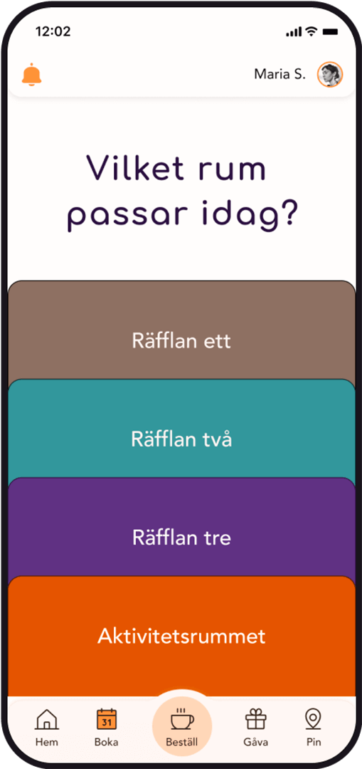
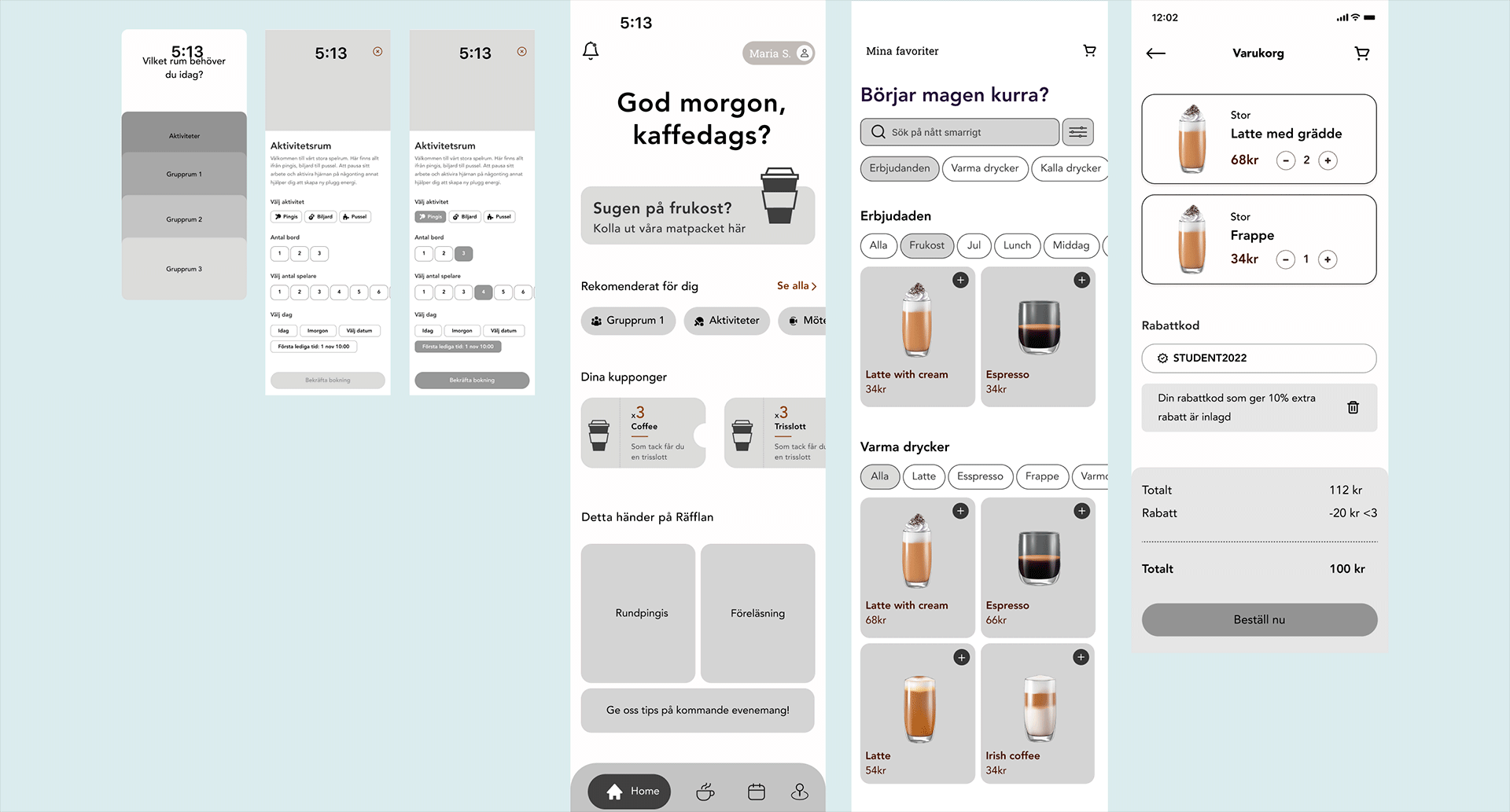
To be able to book different types of meeting rooms, see the cafe's menu beforehand due to allergies but also to be able to receive their order directly when they are there. You can then use your breaks to do an activity instead — increase your creativity!

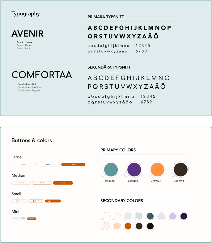
Stylesheet

The result
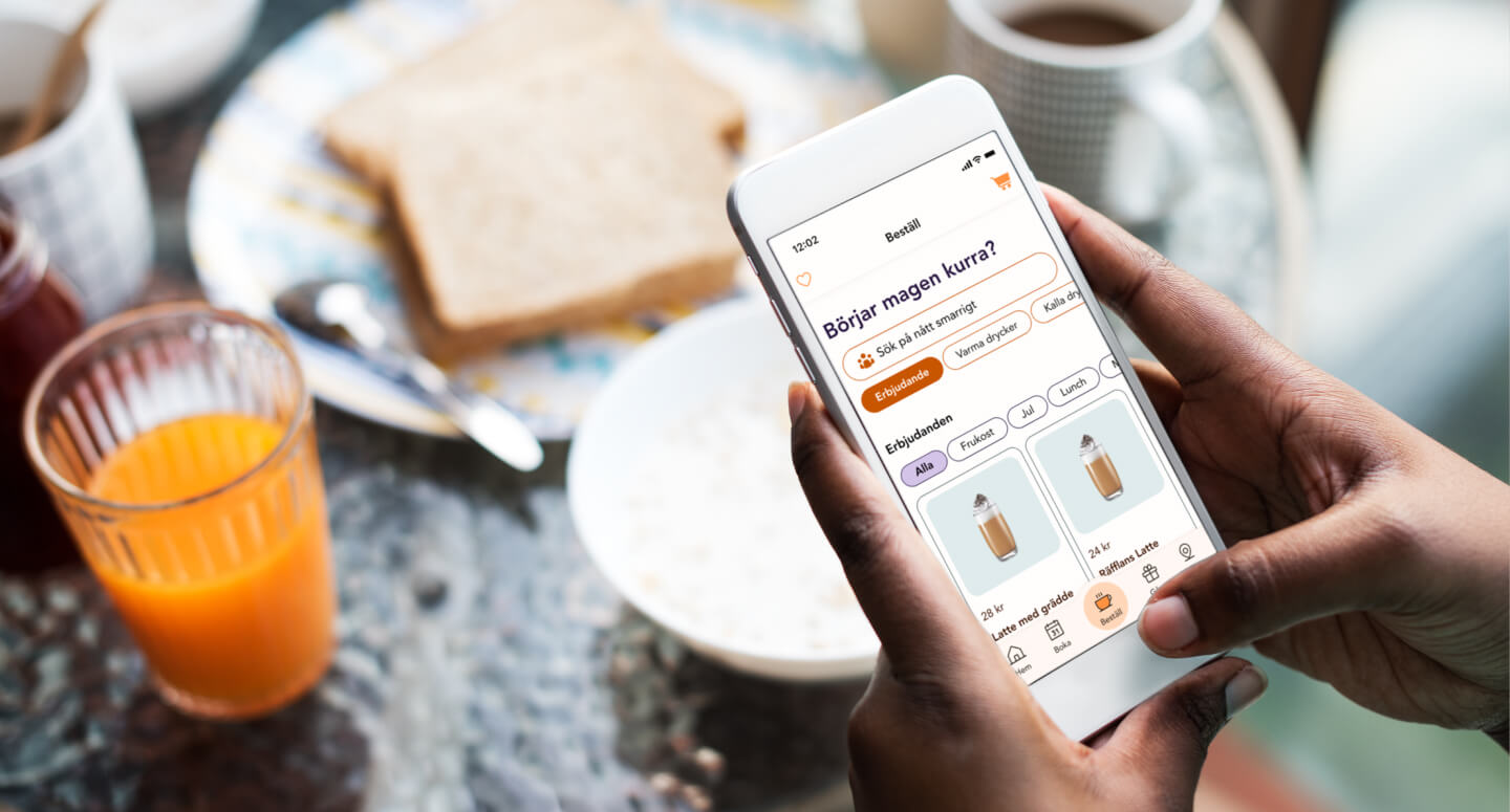
Together we have created a hi-fi app prototype targeting design systems, visual identity and interactive components and animation in Figma.
The prototype consists of clickable and selectable buttons that are made up of interactive variants where you can easily change/hide icon and change text using Text, Instance swap and Boolean properties in Figma. Recurring topbar component to create recognition and improve user experience.
My insight with the use of variants is that it makes it easy to update the design and provides a structured and faster workflow.
This is an ongoing project. Let’s do a collaboration and make Räfflan — A meeting place for students come true! Who is with us?